Process Work
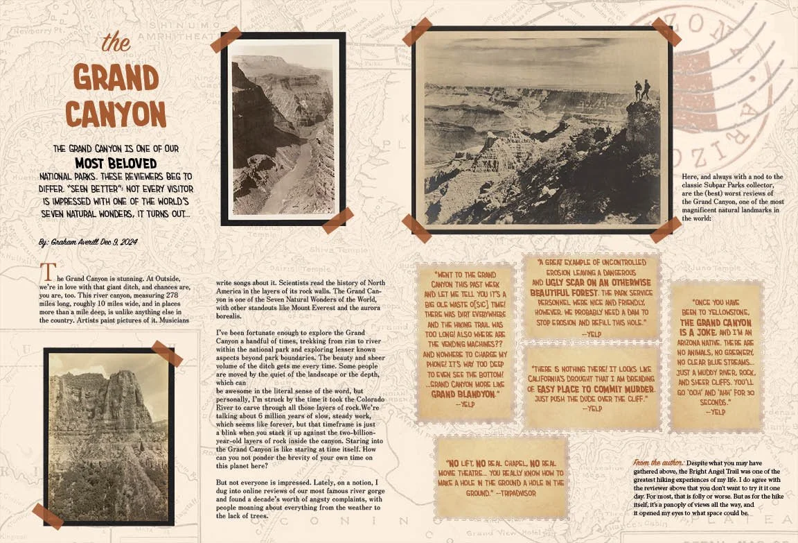
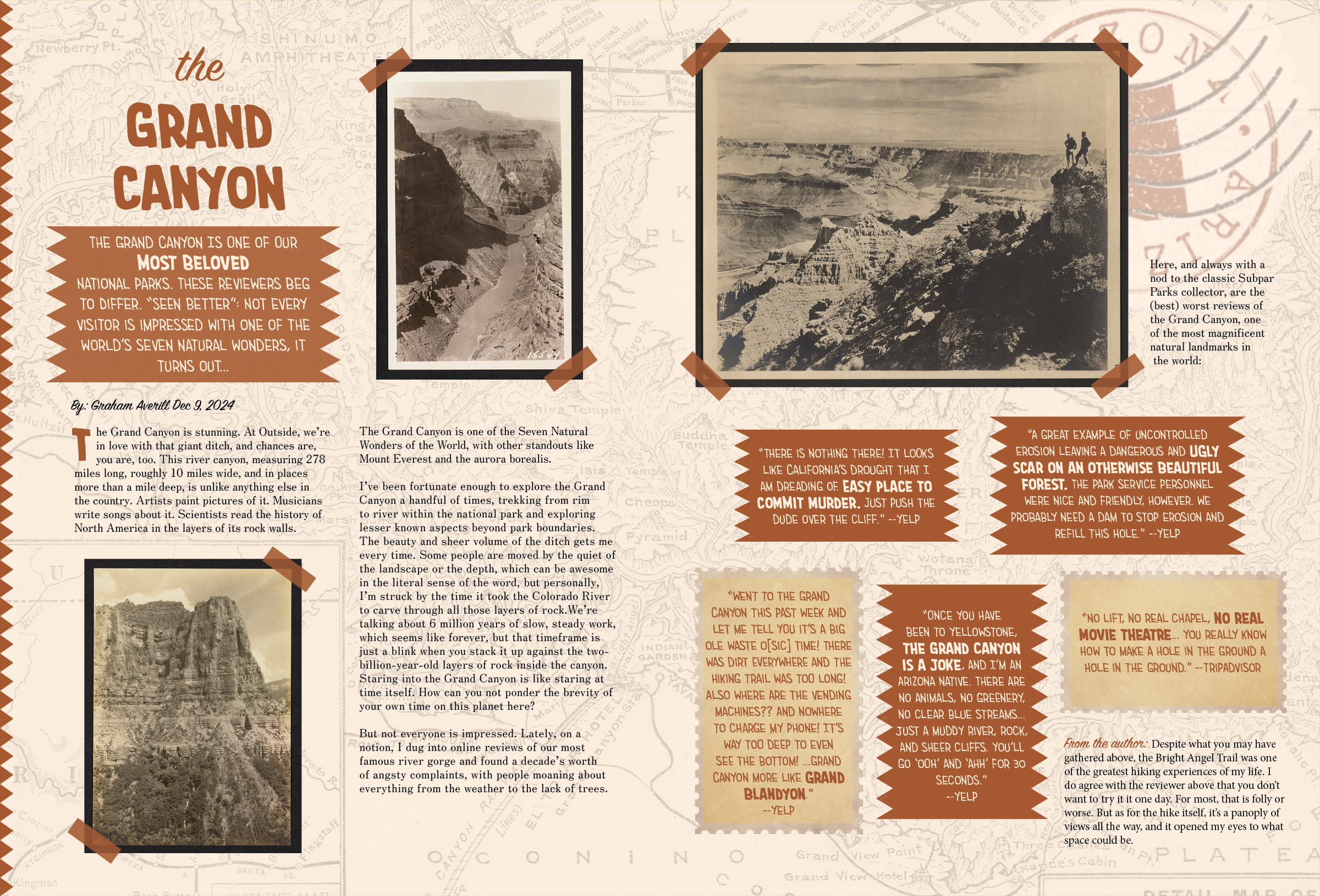
This project was to design a magazine layout for an already provided article, this one highlighting negative reviews of the Grand Canyon. To juxtapose the pessimistic outlook on this beloved national landmark, I designed a spread that reminds the readers why the Grand Canyon became enticing in the first place. I embedded scrapbooking techniques such as stamps, taped in photographs, and overlays to create a layout that feels handmade. The raw earthy colors found in this national park were the incentive behind the ones used within this design in order to present what color is missing within the vintage photos.